# QR Code Print Checklist: Print-Ready Pre-Press Review for QR Symbols
> QR code print checklist for pre-press review: destination, contrast, quiet zone, size by viewing distance, substrate, file format, fallback URL, and sign-off.
Canonical: https://fast-qr.app/blog/print-ready-qr-code-checklist
Last updated: 2026-09-30
Author: [Rehan Haider](https://fast-qr.app/author/rehan-haider)
Published: 2026-04-11
Tags: print design, quality control, qr workflow, print checklist
Printing QR codes is where small mistakes turn into expensive ones. A poster with a code that doesn't scan, multiplied by a 5,000-unit print run, is a campaign you can't fix without a reprint. The good news: most failures are predictable, and a short pre-press review catches almost all of them before the file goes to the printer.
This is the **QR code print checklist** we'd run before sending a real production file — the **print-ready QR code** pre-press review every job should clear before going to press. Work through it in order. If anything fails, fix it before moving on.
## QR code print checklist — quick summary
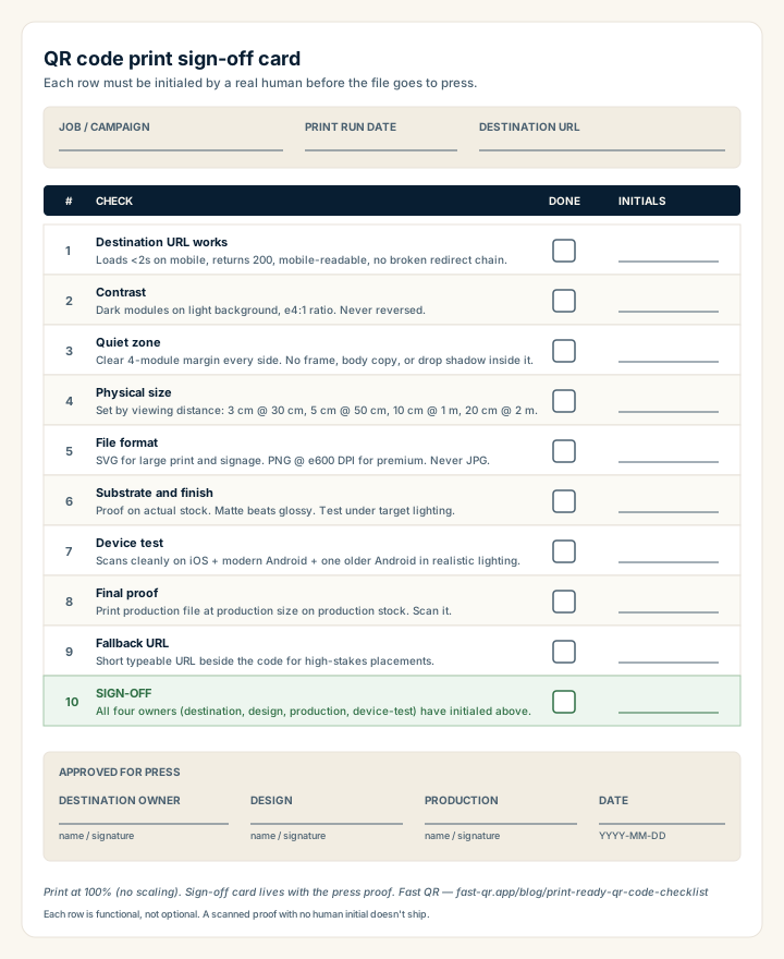
Download or print at 100% scale. Each row must be initialed by a real human — that's the whole point of the card.
The full **QR code pre-press checklist** in one block, printable as a sign-off card:
1. **Destination URL** — loads in under 2 s on mobile, returns 200, mobile-readable, no broken redirect chain.
2. **Contrast** — dark modules on a light background, at least a 4:1 ratio. Never reverse.
3. **Quiet zone** — clear 4-module margin on every side. No frame, body copy, or drop shadow inside it.
4. **Physical size** — set by viewing distance: 3 cm at 30 cm, 5 cm at 50 cm, 10 cm at 1 m, 20 cm at 2 m.
5. **File format** — SVG for large print and signage, PNG at 600 DPI for premium, never JPG.
6. **Substrate and finish** — proof on the actual stock; matte beats glossy for scan reliability.
7. **Device test** — scans cleanly on iOS, modern Android, and one older Android in realistic lighting.
8. **Final proof** — print the production file at production size on production stock; scan it.
9. **Fallback URL** — short typeable URL beside the code for high-stakes placements.
10. **Sign-off** — destination, design, production, and device-test each initialed by a real human.
Each item below explains the rule, the failure mode, and the fix.
## Validate the destination first
Before you touch design details, confirm the page the QR code points to:
- Loads in under 2 seconds on a mid-tier mobile network.
- Has a clear next action above the fold (book, buy, view menu, register).
- Is not blocked behind a login or paywall, unless that's expected.
- Renders correctly on a small phone screen without horizontal scrolling.
- Returns a 200, not a 301-chain or a 404.
A perfectly designed QR code can't fix a weak destination. If the page makes a customer wait, scroll, or guess what to do next, scan rates won't matter. Test the destination on a real phone with mobile data turned on, not on a desktop with a fast wired connection.
If you're using a tracked URL or redirect, scan it end-to-end and confirm the user lands where you expect, with the parameters you expect. Broken redirects are surprisingly common when staging environments get mixed up with production.
## Protect contrast and quiet zone
Reliable scanning depends on strong visual separation between the code and everything around it.
**Dark modules on a light background are safest.** Black on white is the default for a reason. If brand color matters, apply it to the modules (foreground), not the background, and verify contrast above 4:1 with a contrast checker.
**Keep a clean quiet zone of at least 4 modules on every side.** That's roughly 3-5 mm at typical print sizes. No borders, drop shadows, frame elements, or text inside the quiet zone. Designers underestimate how often a "tight" frame eats into this margin and breaks scanning.
**Avoid placing the code over busy photography or textured backgrounds.** The scanner needs a clean threshold between dark and light. A photo background gives it noise.
A tight decorative box around the code is the single most common pre-press mistake. Phones held at an angle, in dim light, or on slightly older cameras lose detection first when the four-module margin is invaded.
If your brand system demands color flexibility, run scan tests before committing to the styling. Visual consistency matters, but a code that takes 4 seconds to scan instead of 1 will silently lose conversions every day it's in the field. The [design best practices guide](https://fast-qr.app/learn/qr-code-design-best-practices) covers brand-color customization in more depth.
## Set physical size by viewing distance
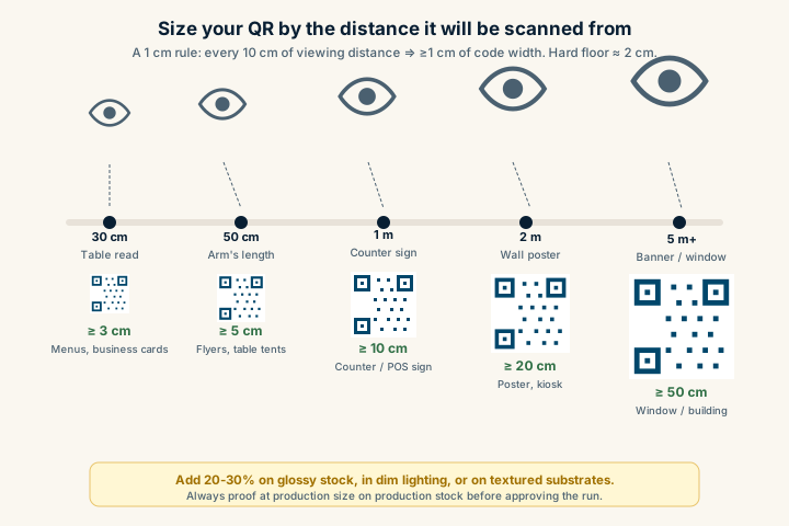
A code that scans on a desk can fail on a poster viewed from across a room. Use the expected scan distance to set print size, then verify from real positions.
Quick reference:
- Table-distance scan (~30 cm): minimum 3 cm.
- Arm's-length flyer (~50 cm): minimum 5 cm.
- Counter sign (~1 metre): minimum 10 cm.
- Wall poster (~2 metres): minimum 20 cm.
- Banner or window display (~5 metres): 50 cm or larger.
Add 20-30% to those minimums if the code will be on glossy stock, in dim lighting, or on a textured substrate. The [size and print guidelines](https://fast-qr.app/learn/qr-code-size-and-print-guidelines) cover the full sizing math.
## Validate substrate, finish, and placement
Material decisions change scan quality more than most teams expect. Before approving a final print quantity:
- Test matte vs glossy finish on a physical proof. Gloss varnish reflects overhead light and can wash out modules.
- Test under both direct and indirect lighting. A code that scans fine in your office may fail under retail spot lighting.
- Avoid placing codes near folds, seams, or curved edges on packaging. A code that crosses a fold is one open-and-close away from being unscannable.
- For packaging on cans or bottles, keep the QR on the flattest available surface, never on the steepest curve.
- For laminated menus, scan after lamination, not before. The film changes everything.
Strong QR performance on the screen often fails in production because finish decisions were made after scanning tests, not before.
## Test from the final exported file
Don't approve from a Figma preview, an InDesign artboard, or a PDF on screen. Export the exact final file format you'll send to the printer, print a proof at production size on the production substrate, and scan it.
A few specifics:
- If the printer is asking for SVG, [export an SVG](https://fast-qr.app/static/url-to-svg) and confirm it opens cleanly in their tool.
- If the printer is asking for PNG, [export at full resolution](https://fast-qr.app/static/url-to-png) for the target DPI (300 DPI for posters, 600 DPI for premium menus and packaging).
- Don't email the QR file to yourself, screenshot it, then send the screenshot to the printer. Every re-encoding step risks introducing artifacts.
## Check destination and campaign alignment
A technically scannable code can still underperform if the destination doesn't match what the print piece promised. Before final approval, verify:
- Headline continuity between the print asset and the landing page. If the poster says "Summer menu," the page shouldn't be the homepage.
- One clear primary action above the fold on mobile.
- Mobile readability without zoom, with tap targets sized for thumbs.
- Any campaign parameters (UTMs, source codes, location IDs) are firing correctly into your analytics.
Walk through the full scan-to-action flow on a phone. If anything feels slower or more confusing than it should, the print run isn't the time to find out.
## Add a fallback for critical campaigns
For high-stakes placements (storefront windows, packaging, signage you can't easily reprint), include a short fallback URL near the QR code. Something like `example.com/menu` or `exmp.co/sp1`.
This costs almost nothing and saves you when:
- A customer's camera is damaged or restricted.
- Their scanner app has trouble with your specific code.
- The lighting is genuinely impossible (back-lit window, deep shadow, glare-bright sun).
- Someone wants to type the URL on a desktop later.
The fallback URL should be short enough to type by hand, which usually means a custom short domain or a clean path.
## Build a repeatable sign-off
The best way to keep print QR performance consistent across teams and campaigns is to make the review repeatable. A fixed sign-off list:
1. **Destination approved** by the team that owns the landing page.
2. **Contrast and quiet zone approved** by design.
3. **Size and substrate approved** by production.
4. **Device tests passed** on iOS and Android, including one older device.
5. **Final proof scanned** from the actual printed substrate, under realistic lighting.
6. **Fallback URL or instructions confirmed** for high-stakes placements.
Each sign-off should be initialed by a real person, not auto-checked. The whole point is to force a human to physically scan a physical proof before the run goes ahead.
## Plan post-launch monitoring
After distribution, monitor real scans by asset type and location. If one placement underperforms, that's a signal to update layout rules before the next run.
What to watch:
- Total scans per placement (against expected volume).
- Scan-to-action conversion (does the destination work as planned?).
- Time-of-day or location patterns that suggest lighting or visibility issues.
- Drop-offs after specific campaign updates (a redirect change, a destination redesign).
If you're working without a dynamic redirect platform, you can still attribute by giving each placement its own clean path or UTM combination. The [static vs dynamic QR codes](https://fast-qr.app/blog/static-vs-dynamic-qr-codes) guide covers attribution strategies that don't require subscription tooling.
## Production playbooks for common use cases
Pre-press quality is one input. The other is matching the QR to the use case. For production-specific decisions on layout, fallback messaging, and destination structure:
- [Retail packaging](https://fast-qr.app/qr-code-for/retail-packaging) covers substrate, curvature, and shelf-lighting realities.
- [Restaurant menu](https://fast-qr.app/qr-code-for/restaurant-menu) covers lamination, table-distance sizing, and offline fallbacks.
- [Real estate flyers](https://fast-qr.app/qr-code-for/real-estate-flyers) covers walk-by distances and listing-specific destinations.
- [Payment links](https://fast-qr.app/qr-code-for/payment-links) covers trust signals and fallback URL formats.
Use this checklist for the technical review, then layer the use-case playbook on top for layout and copy decisions specific to your channel.
For the design layer that sits above this checklist, [the QR code design principles post](https://fast-qr.app/blog/qr-code-design-principles) covers error correction trade-offs, module shapes, and brand customization. For accessibility-specific design choices, see [accessible QR code design](https://fast-qr.app/blog/accessible-qr-code-design). And if a printed code is already in production and failing, [the 12 most common QR code mistakes](https://fast-qr.app/blog/common-qr-code-mistakes) and [why some QR codes don't scan](https://fast-qr.app/blog/why-qr-codes-fail-to-scan) are the diagnostic companions to this pre-press list.
Choose the artwork format before sending the file: the [PNG versus SVG comparison](https://fast-qr.app/learn/qr-format-png-vs-svg) explains scaling and pixel resolution.
## Sources
- [ISO/IEC 18004:2015](https://www.iso.org/standard/62021.html) — Print-quality requirements, quiet-zone specification, and reading-condition guidance for QR symbols.
- [Denso Wave — QR Code version](https://www.qrcode.com/en/about/version.html) — Module count and capacity per version, the basis of the size-by-distance math used in the checklist.
- [GS1 — Barcode verification](https://www.gs1.org/standards/barcodes/verification) — Industry standards for verifying barcode print quality before deployment to packaging or signage.
- [Wikipedia — QR code](https://en.wikipedia.org/wiki/QR_code) — Background on QR structure relevant to print sizing and error-correction trade-offs.
## Frequently asked questions
### What's the most common reason a QR code fails after printing?
Physical size. Most printed-code failures trace back to a code that looked fine on a 27-inch monitor but ended up at 1.5 cm on a flyer. The rule of thumb: a printed QR needs roughly one centimetre of width per ten centimetres of intended scan distance, with a hard floor around 2 cm even for tabletop reads.
### How do I test a QR code before sending it to print?
Print a one-off proof on the actual production stock at the actual production size. Hand it to three people with three different phones (one iOS, one modern Android, one older Android if possible) and ask them to scan from the distance and lighting the customer will use. If any of them fails or hesitates, the code needs work.
### What file format should I send to the printer for a QR code?
SVG is the safest choice — it scales without artifacts and the file size is tiny. PNG works at high resolution if you generate it at the final printed size at 600 DPI minimum. Avoid JPG entirely; JPEG compression introduces artifacts at the sharp module edges that confuse phone cameras.
### How big should the quiet zone around a printed QR code be?
At least four modules of blank space on every side, which is roughly 3-5 mm at typical print sizes. The quiet zone is functional, not decorative — scanners use it to lock onto the finder patterns. A frame, drop shadow, or body copy that intrudes into the quiet zone is the most common cause of slow or failed scans on phones held at an angle.
### Should I include a fallback URL next to my QR code?
Yes for any high-stakes placement (storefront windows, packaging, signage you can't easily reprint). A short typeable URL like exmp.co/sp1 next to the code costs almost nothing and rescues the user when their camera is damaged, the lighting is impossible, or they want to type the URL on a desktop later.