
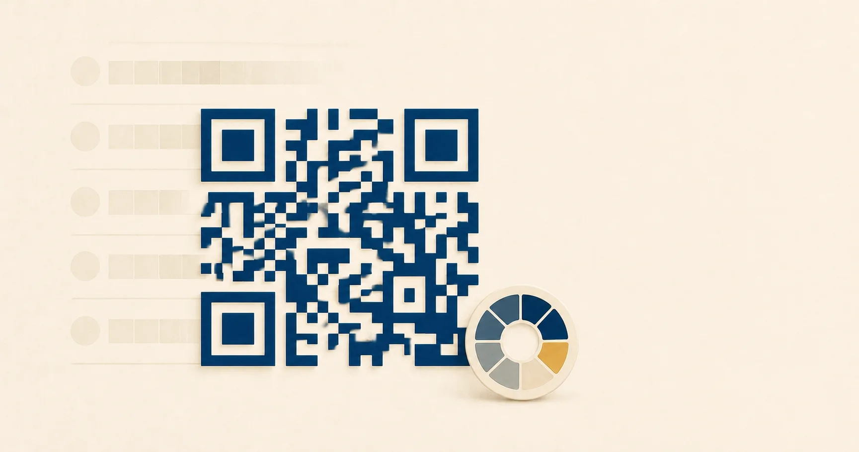
A colored QR codeA 2D matrix barcode that encodes data in a square grid of black and white modulesA single black or white square in the QR grid. The number of modules per side scales with the QR versionThe size of a QR code, numbered 1 (21×21 modules) through 40 (177×177). Higher versions store more data but require more printed space. Read more →, from 21×21 modules for version 1 up to 177×177 for version 40. Read more →. Read more → is a frequent brand request and a frequent scan-failure cause. The real question is rarely “what colors are allowed.” It is how far you can push toward brand-matching paint chips before scans degrade for real customers on real phones.
This page goes deeper than the broader design best practices guide on color. It covers what contrast actually means for a phone camera, where inversion works, what print substrates do to perceived color, when multi-color codes are safe, and how to test before a print run.
Why is dark-on-light the safe default?
Phone cameras and decoder libraries are tuned around an assumption that goes back to the original QR Code specification from Denso Wave in 1994: dark modules on a light background. The scanner’s first job is to find a luminance threshold separating “module” from “not module” across the image. With strong dark-on-light contrast, that threshold is obvious and survives uneven lighting.
The default holds for three reasons that all affect real users:
Most scanner libraries run adaptive thresholding tuned for high-contrast bilevel input. Anything that compresses the dynamic range, like colored modules or tinted backgrounds, reduces the algorithm’s headroom.
Phone camera auto-exposure and white balance are tuned for documents, faces, and outdoor scenes, not two-color graphic art. A black code on white paper triggers exposure clipping that helps the decoder. Pastel codes on cream backgrounds confuse exposure metering.
Older phones, budget Android devices, and damaged camera lenses all benefit disproportionately from high contrast. Your customers will mostly not be on flagship hardware in studio lighting.
Stay close to the default and you inherit decades of scanner tuning for free.
How to add brand color without breaking scans
Three rules cover most of what works in practice.
Keep luminance contrast above 4:1. Tools like contrast-ratio.com or any accessibility checker will compute this in seconds. The 4:1 floor matches the WCAG body-text contrast threshold, which is also a usable floor for QR scans on phone cameras. Below that, you start seeing failures on older phones, in dim light, and at small print sizes. Those are exactly the conditions where customers get frustrated and walk away.
A useful diagnostic: convert your colored code to grayscale. If the modules and background look high-contrast in grayscale, the luminance contrast is real. If they collapse into similar shades of gray, the apparent contrast was hue-driven and the scanner will struggle.
Apply brand color to the modules, not the background. Foreground tinting (deep navy on white, forest green on cream) preserves the scanner’s ability to classify each module as dark. Background tinting compresses contrast and pushes the decoder toward its failure threshold faster. If the brand calls for a colored “panel” feel, apply that color to a frame around the code with the area immediately around the modules kept light.
Avoid red on white. Red has the lowest luminance contrast against white in the visible spectrum, and the trap is that it looks fine on a calibrated monitor. Phone cameras struggle under non-ideal lighting. If the brand demands red, use a deep maroon or burgundy that reads near-black in grayscale. The same caution applies to bright orange, yellow, and any saturated warm color on a light ground.
These rules interact with size and density. A short URL printed at 5 cm with deep navy modules on white will scan beautifully. The same color on a 200-character tracking URL at business-card size will fail intermittently because the modules become too small to resolve at reduced contrast. The error correction explainer covers how URL length maps to density.
Inverted codes: light modules on dark
Inversion works, but barely. iOS native scanners have historically been more permissive about inverted codes than third-party decoders, and most current Android phones handle them. Older devices and some specialty scanner apps still assume dark-on-light and silently fail.
If you must invert, the rules tighten:
The dark background needs to be genuinely dark. Medium gray with white modules will not produce enough luminance separation. Aim for background luminance under roughly 25% and modules near 100%, well past the 4:1 threshold.
The quiet zone needs to be the same dark color as the rest of the background, with full four-module spacing. A common failure: an inverted code sits on a dark panel that ends with a hard edge inside the quiet zoneThe unprinted margin of at least four modules' width that must surround every QR code. Read more →. Scanners then struggle to find the boundary.
Test on at least one budget Android three to four years old. Flagships compensate for a lot that mid-range hardware does not, and a campaign printed on inverted codes can fail silently in customer hands while looking fine in your studio. The size and print guidelines cover device-spread testing.
For dark-themed event materials where inversion feels required, consider an alternative: keep the QR area as a small light panel inside the larger dark layout. The scanner sees a normal dark-on-light code, and visual continuity comes from how the panel is framed. The event check-in playbook covers this pattern.
Background patterns and gradients
Gradients, photo backgrounds, and watermarks behind the QR code modules are almost always a mistake.
The decoder’s adaptive thresholding works on local luminance. Across a small region, it expects clear separation between dark and light. A gradient introduces a continuous luminance shift, and depending on direction and the phone’s auto-exposure, parts of the code may end up below threshold and parts above it. The result is intermittent scans that work for some users and fail for others, with no obvious pattern to debug.
Photographic backgrounds are worse, because they introduce noise at the same spatial frequency as the modules. The scanner cannot distinguish “small dark feature in the photo” from “module of the QR code.”
The fix is structural: put the code on a clean, solid panel. Even a subtle pattern with 10% luminance variation will degrade scans on older phones in marginal lighting. If a gradient is non-negotiable, route it through a logo plate: a solid white shape behind a centered logo, with the gradient as a frame outside the finder patterns and quiet zone.
Print substrate effects on color
Color decisions made on a calibrated monitor change in print, sometimes dramatically.
Kraft and recycled stock warm every color. A clean dark navy on bright white reads as deep blue. The same ink on brown kraft reads as muddy slate, and contrast against the warm-brown background drops. If the brand uses kraft, increase module size by 25-50% and consider printing on a clean white sticker applied to the surface. The cafe loyalty playbook covers kraft-on-coffee-cup decisions specifically.
Matte versus glossy lamination changes perceived contrast. Glossy varnish over a colored code creates specular highlights under directional light, and those highlights can wash out modules in the customer’s camera. Matte lamination reduces this risk. If you need gloss for the rest of the piece, request a matte panel just over the QR area.
Foil printing rarely works regardless of color. The reflective surface creates highlights and shadows that confuse the scanner. If brand identity demands foil somewhere, place the QR on a flat, matte panel adjacent to the foil.
Color separation drift is the silent problem on long print runs. A teal that looks correct on the proof can shift toward green or blue as the press warms up. Check the printed code on a sample from the actual run, not just the press proof. If contrast is marginal at proof, it will be unreliable across parts of the run.
For sizing math and substrate guidance, see the size and print guidelines. For pre-press review, the print-ready QR checklist walks through specifics.
Multi-color QR codes with per-finder-pattern color
A more aggressive treatment: each of the three corner finder patternsThe three large squares in the corners (top-left, top-right, bottom-left) of every QR code. Scanners use them to detect a QR in the camera frame, lock onto it, and determine its orientation. Read more → gets its own color, with the rest of the modules in a fourth color. Done well, it produces a striking branded code. Done poorly, it produces an unscannable mess.
The constraints that make it work:
Error correctionMathematical redundancy built into every QR code that lets it scan correctly even if part of the matrix is damaged, dirty, smudged, or covered (for example by a logo). Read more → must be set to H (30% recovery). Multi-color treatments introduce risk that the decoder will misclassify modules, and the H level absorbs that risk. The error correction explainer covers what each level recovers.
Each color individually needs to clear the 4:1 luminance threshold against the background. Not “average across the code.” Each finder pattern on its own.
Print size needs to be generous. Per-finder-pattern color is a poster treatment, not a business-card treatment. At small sizes the finder patterns themselves are hard to resolve, and color variation makes them harder. A 5 cm code with three differently-colored finder patterns will fail more often than a 15 cm version.
The substrate must be smooth. Textured kraft and recycled stocks compromise color separation. Smooth coated stock or vinyl is better.
The event sponsor activation playbook is a scenario where multi-color treatments are sometimes worth the risk for visual differentiation, but test exhaustively before scaling. If any constraint fails, drop back to single-color modules. A subtler design that scans every time outperforms a striking one that fails 5% of attempts.
Testing a colored QR before you ship
A contrast checker is the first stop, not the last. The full protocol:
- Compute luminance contrast with contrast-ratio.com or any WCAG checker. Confirm above 4:1, ideally above 7:1 for marginal substrates.
- Convert the proof to grayscale. If modules still read as clearly distinct, the contrast is real. Hue contrast that vanishes in grayscale will fail on phone cameras.
- Print at final size on the actual final substrate. A digital proof on coated paper does not predict scanning on kraft, recycled stock, or post-lamination.
- Scan from realistic distance. A table tent is scanned from 30 cm; a wall poster from 1-2 metres.
- Scan under realistic lighting. Overhead glare, dim restaurant light, sunlight through a window, fluorescent office. Each stresses exposure and white balance differently.
- Test on at least four phones: one current iPhone, one current Android flagship, one budget Android three or more years old, and one with a slightly scratched or smudged lens. The older and damaged devices matter more than the flagships.
- If the design includes a logo, test the post-logo code. A logo on a colored code stresses error correction harder than a logo on black-and-white.
For high-stakes campaigns, scan a real production sample before final approval. Reprinting 10,000 menus because the code scans inconsistently costs far more than a longer proofing round. Generate the SVG file for press and a PNG file for digital previews.
When to skip the color
Some scenarios are not the right place for brand color:
Small print sizes. Anything under 2.5 cm is already at the resolution edge of phone cameras. Colored modules remove margin the scanner needs.
Dim or variable lighting. Restaurant interiors, nightclub posters, warehouse signage. Camera exposure is inconsistent, and high contrast is the only thing keeping scans reliable.
High-density URLs. A long URL with tracking parameters produces a higher QR version with smaller modules. Smaller modules plus colored modules stacks two reductions in scanner headroom.
Textured substrates. Kraft, linen-finish card stock, recycled paper. Texture already breaks the clean module edges the scanner expects. Color compounds the problem.
Codes that need to scan for anyone, anywhere. Public infrastructure, tickets, payment surfaces. The customer base is too broad to assume modern hardware.
In those cases, ship the QR in dark navy or pure black on white. Brand expression can come from layout, label microcopy, and frame design. A bare QR with a strong “Scan to view menu” label outperforms a stylized colored code that occasionally fails. The restaurant menu playbook covers tested microcopy patterns.
Sources
- Wikipedia — QR code — Technical overview including module structure, contrast requirements, and decoder behavior.
- Denso Wave — About QR Code — Primary documentation from the inventor of the QR specification.
- ISO/IEC 18004:2015 — International standard defining QR symbology, including reflectance and contrast requirements for reliable decoding.
- Wikipedia — Web Content Accessibility Guidelines — Source of the 4:1 luminance contrast threshold used as a practical floor for QR scans.