
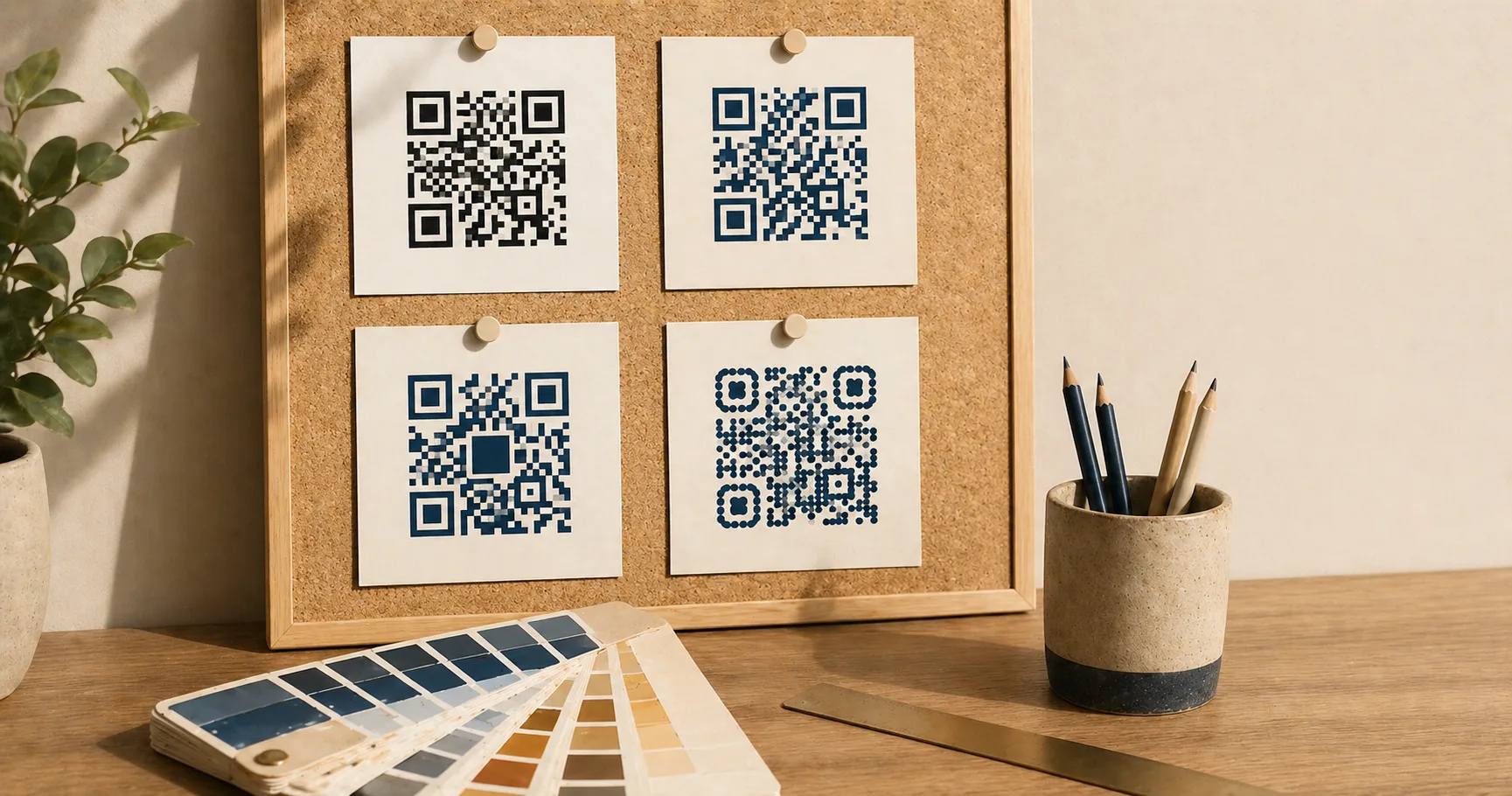
QR codeA 2D matrix barcode that encodes data in a square grid of black and white modules. Read more → design is the practice of customizing a QR code’s color, moduleA single black or white square in the QR grid. The number of modules per side scales with the QR versionThe size of a QR code, numbered 1 (21×21 modules) through 40 (177×177). Higher versions store more data but require more printed space. Read more →, from 21×21 modules for version 1 up to 177×177 for version 40. Read more → shape, frame, or center logo without compromising its ability to scan reliably. Designing a QR code is a balancing act. You want it to match your brand, but you also need it to scan instantly on real phones under real lighting. Most “stylish” QR codes fail because design decisions blur the module grid, eat into the quiet zoneThe unprinted margin of at least four modules' width that must surround every QR code. Read more →, or push contrast below what phone cameras can handle.
This guide explains what you can customize safely, what to avoid, and how to test before you commit to a print run or a sticker order.
Scan reliability beats aesthetics
A beautifully designed QR code that fails to scan is worse than a plain one that works. If a customer tries once and nothing happens, most won’t try again. Treat QR reliability the way you’d treat checkout reliability on a website: it’s a conversion surface, and every failed scan is lost intent.
When you customize, keep these priorities in order, and treat each one as a gate the next has to pass through:
- Contrast between modules and background.
- Quiet zone intact on all four sides.
- Module clarity with clean square edges, no blur.
- Logo size small enough that error correctionMathematical redundancy built into every QR code that lets it scan correctly even if part of the matrix is damaged, dirty, smudged, or covered (for example by a logo). Read more → can recover.
- Styling (rounded modules, frames, gradients) only after the four above still hold.
If a styling decision pushes any of the first four into the danger zone, that decision loses.
Color: stay close to dark-on-light
The default of black modules on a white background is the default for a reason. Phone cameras are tuned for it, decoding libraries assume it, and the human eye reads it instantly. Anything that moves away from that baseline costs you scan reliabilityHow consistently a QR code scans across different devices, lighting conditions, distances, and orientations. Read more → somewhere, and the cost shows up first on older phones, in dim light, and at small print sizes.
That said, brand colors are a real constraint. A few moves work without breaking things:
Keep contrast above 4:1. Tools like contrast-ratio.com check this in seconds. Below 4:1 you start to see scan failures on older phones, in low light, and at small print sizes. Those are exactly the conditions where a real customer is trying to scan and getting frustrated.
Apply brand color to the modules, not the background. Foreground tinting (dark blue modules on white, dark green on cream) preserves the scanner’s ability to classify dark vs light. Background tinting tends to compress contrast.
Inversion (light modules on dark) works, but barely. Some camera apps still assume dark-on-light and silently fail. If you must invert, test on at least one iOS device and one Android budget phone before printing.
Red on white is the most common failure mode. It looks fine on a monitor, but red has the lowest luminance contrast against white in the visible spectrum. Phone cameras struggle. Use a dark red, a dark blue, or near-black instead, and verify with a contrast checker.
Patterned, photographic, or gradient backgrounds behind the modules are almost always a mistake. The scanner has to find a clean light/dark threshold, and a textured background gives it noise. The dedicated colored QR code guide goes deeper on contrast ratios, inversion limits, and print-substrate effects.
Logos without breaking scans
A centered logo is the most common QR customization, and it works reliably if you respect a few constraints. The QR spec includes error correction precisely so codes can survive missing data, which is what a logo is from the scanner’s perspective.
Logos work best when:
- Error correction is set to H (30% recovery, the highest level).
- The logo is centered, not floating off to one side.
- The logo doesn’t cover the three corner finder patternsThe three large squares in the corners (top-left, top-right, bottom-left) of every QR code. Scanners use them to detect a QR in the camera frame, lock onto it, and determine its orientation. Read more → or the alignment patternSmaller square patterns scattered through QR codes from version 2 onward. They help scanners correct for perspective distortion when the code is photographed at an angle, on curved surfaces, or with a wide-angle lens. Read more →.
- The logo size stays under roughly 20-25% of the total code area.
Practical guidelines that follow from those constraints:
Use a small “logo plate” behind the artwork. A clean white circle or rounded rectangle behind the logo gives the scanner a sharp boundary instead of asking it to interpret module-on-logo edges. Five to eight pixels of padding is usually enough.
Avoid logos with thin lines or fine type. Thin strokes blend into the module grid and confuse decoders. Solid shapes, simple wordmarks, and high-contrast monograms work better than detailed illustrations.
Test against the version of the code you’ll actually ship. A logo that looks fine on a low-density code (Version 2-3) can wreck scanning on a high-density code (Version 8+) because the modules behind it are smaller and more numerous.
A logo blocks data modules. Error correction recovers some of that loss, but not all of it. If you’re already pushing other constraints (small size, brand color, glossy substrate), keep the logo conservative.
Rounded modules and stylized eyes
Rounded modules and custom finder-pattern shapes can work if the code remains high-contrast, with clean edges, at adequate size. Larger codes tolerate styling far better than small ones, so a stylized poster QR is much safer than a stylized business card QR.
These styles fail most often in two scenarios. First, when modules become too small. A dense URL printed at business-card size with rounded modules pushes the geometry into ambiguity, and budget phone cameras start to miss it. Second, when the styling reduces the “square-ness” of modules so far that the sampling algorithm can’t lock onto the grid.
If you want rounded styles, test on older phones explicitly. High-end iPhone and Pixel cameras compensate for a lot more than mid-range Android devices, and your customers are more likely to be on the latter.
Frames and call-to-action labels
Frames around the QR code can actually increase scan rate, because they communicate intent. A box that says “Scan me” or “Scan to view menu” gives the user a reason to pull out their phone, which a bare QR code doesn’t. The frame itself isn’t the problem.
The problem is when frames break scanning. That happens when they invade the quiet zone, when decorative borders sit too close to the code, or when the frame introduces a low-contrast background behind the modules.
Safe frame rules:
- Keep the quiet zone fully clear; frame elements live outside it, never inside.
- Place label text below or beside the code, not overlapping the QR boundary.
- If the frame has a colored background, keep the area immediately around the code white or near-white.
A frame that says “Scan me” with an arrow pointing at the code will outperform a bare QR almost every time, but only if it doesn’t compromise the code itself.
Quiet zone is part of the code
Designers often treat the QR like a logo-shaped element that can be cropped tight against other content. That’s the single most common reliability mistake.
The quiet zone, the blank margin of at least 4 modules on every side, is part of the machine-readable boundary. Without it, scanners struggle to detect where the code ends and the surrounding artwork begins. You’ll notice it most on phones held at an angle or in low light, where the algorithm needs every advantage it can get.
If a layout feels too loose around the code, don’t shrink the quiet zone. Place the code on a clean card, a colored block, or a defined background area so the margin reads as intentional whitespace.
Which file format should you use?
Reliability is partly about how you export and where:
- SVG is best for print, signage, and any design tool that supports vector. It scales without blur regardless of final size.
- PNG is the right general-purpose raster: web pages, slide decks, social posts, and quick sharing.
- JPG is acceptable when a platform requires it, but compression artifacts can blur module edges and reduce reliability. Generate at maximum quality if you have to use it.
Generate each format directly: SVG, PNG, or JPG. For Wi-Fi codes, the Wi-Fi to PNG generator handles SSID and password formatting for you.
Microcopy that earns scans
A QR code with no explanation is often ignored. People won’t pull out their phone unless they know what they’re scanning into. A single line of microcopy near the code can dramatically lift scan rates and reduce hesitation:
- “Scan to view the menu (no app needed)”
- “Scan to pay securely on example.com”
- “Scan to join guest Wi-Fi”
- “Scan to register in 30 seconds”
Microcopy also helps with safety. It sets expectations, so users can spot suspicious behavior (like an unexpected login screen) before they hand over information. The are QR codes safe guide covers user-side safety in more depth.
For specific scenarios, the restaurant menu, guest Wi-Fi, and payment links playbooks include tested microcopy patterns.
Testing is the only sign-off that counts
You cannot approve a QR code design from a perfect vector preview on a 27-inch monitor. Real scans happen at real sizes under real lighting on real phones, and that’s where reliability either holds or doesn’t.
Test before you ship:
- At actual size. Print the proof, or display at intended screen size, then scan.
- Under real lighting. Overhead glare, dim restaurant lighting, outdoor sunlight, fluorescent office light. Each one stresses the camera differently.
- From realistic distance. A table tent is scanned from 30 cm; a wall poster from 1-2 metres. Test from where your customer will actually stand.
- On multiple phones. At minimum, one iOS and one Android, with at least one budget or older device in the mix.
- After a finish is applied. Lamination, gloss varnish, or shrink-wrap can introduce reflections that change scan behavior. Test the final substrate, not the unfinished proof.
For large print runs, do at least one full physical proof scan before final production. The cost of reprinting 10,000 menus because the QR codes are slightly off is much higher than the cost of an extra proofing round.
The print-ready QR code checklist walks through pre-press review in more detail, and the size and print guidelines cover sizing math.
Customizing without breaking scans
If you want an on-brand QR code with minimal risk, work in this order:
- Start with a standard black-on-white code at the size you intend to ship.
- Increase size until scans feel instant on a budget Android.
- Add brand color to the modules while keeping the background light.
- Add a small centered logo on a clean plate, with error correction set to H.
- Add microcopy nearby explaining the action and destination.
- Re-test on multiple phones, distances, and lighting conditions.
If scan performance drops at any step, revert that step before continuing. The cost of one revert is small. The cost of a campaign with a broken code is not.
For an opinionated walk-through of the same trade-offs — error correction, module shapes, frame design, when it’s safe to break the rules — see QR code design principles. For accessibility-driven design choices (sizing for low-vision users, contrast beyond the WCAG minimum, fallback URL patterns), see accessible QR code design.
Sources
- Wikipedia — QR code (Design) — Module patterns, finder pattern requirements, and stylization considerations.
- Denso Wave — QR Code variants — Variants and design choices supported by the QR specification.