
Print-ready QR codeA 2D matrix barcode that encodes data in a square grid of black and white modules. Read more → sizing is the practice of matching a printed code’s physical width to its expected scan distance so phone cameras can resolve every moduleA single black or white square in the QR grid. The number of modules per side scales with the QR versionThe size of a QR code, numbered 1 (21×21 modules) through 40 (177×177). Higher versions store more data but require more printed space. Read more →, from 21×21 modules for version 1 up to 177×177 for version 40. Read more → cleanly. Most QR code failures in print have nothing to do with the generator. They happen because the printed code is too small, too low-contrast, or too close to other design elements to be detected reliably under real lighting. The fix is almost always the same: more size, more contrast, more margin.
This guide covers practical sizing and production rules for posters, menus, packaging, and signage, with the math you actually need to apply.
The two constraints that decide print success
A printed QR code has to satisfy two conditions before it will scan reliably:
- The camera must resolve individual modules (the tiny squares that make up the pattern).
- The scanner must recognize the code boundary, which depends on the quiet zoneThe unprinted margin of at least four modules' width that must surround every QR code. Read more → around the code.
If either fails, scanning fails, even if the encoded data is perfect. Most of the rules below come back to one of those two constraints.
Why is the quiet zone overlooked?
The quiet zone is the empty margin around the QR code pattern. It is not optional decoration. It is part of what makes the QR code detectable to a phone camera.
The rule is straightforward:
- Keep at least 4 modules of blank space on all sides.
- Don’t put borders, drop shadows, or background patterns inside the quiet zone.
- Treat that space as part of the code itself, not as a layout margin you can tighten later.
The most common failure pattern: a designer puts a thin box border tight around the QR code to make it feel framed, and that border breaks the quiet zone. Detection slows down or fails entirely on phones held at an angle. You’ll see this on hastily-designed restaurant menus, where a stylized frame eats into the margin and customers stand there waiting for the menu to load.
At typical print sizes, a 4-module quiet zone is about 3-5 mm. Plan for it from the start of the layout, not after the design is done.
Size: how big should the QR code actually be?
There isn’t one universal size, because scan distance varies. A QR code on a table tent gets scanned from 30 cm. A QR code on a trade-show banner gets scanned from 2-3 metres. They cannot be the same size.
The right way to plan: decide the expected scan distance first, then size the code so modules are clearly resolved at that distance.
A distance-to-size rule of thumb
As a starting point:
QR size ≈ scan distance ÷ 10
Some concrete examples:
- Users scanning from ~30 cm (across a restaurant table): a 3 cm code is comfortable.
- Users scanning from ~50 cm (arm’s length, holding a flyer): a 5 cm code works.
- Users scanning from ~1 metre (a counter sign): aim for 10 cm.
- Users scanning from ~2 metres (a wall poster in a lobby): you need around 20 cm.
- Users scanning from ~5 metres (a banner or window display): 50 cm or larger.
This isn’t a physics law, it’s a planning shortcut. Lighting quality, camera quality, and surface conditions can push the required size up. If the print is going on a glossy substrate, into dim lighting, or onto a textured surface, add 20-30% to the calculated size.
What “too small” looks like in practice
QR codes become unreliable when:
- Modules are tiny relative to the camera sensor at scan distance.
- The code is printed on textured stock, kraft paper, or rough cardboard.
- The code is viewed through glare from lamination, glass cases, or glossy packaging.
- The substrate is curved (cans, bottles, mug handles, lanyards).
When in doubt, increase size and simplify styling. There’s almost no real-world penalty for printing a code 20% larger than necessary, but there’s a significant penalty for printing it 20% smaller.
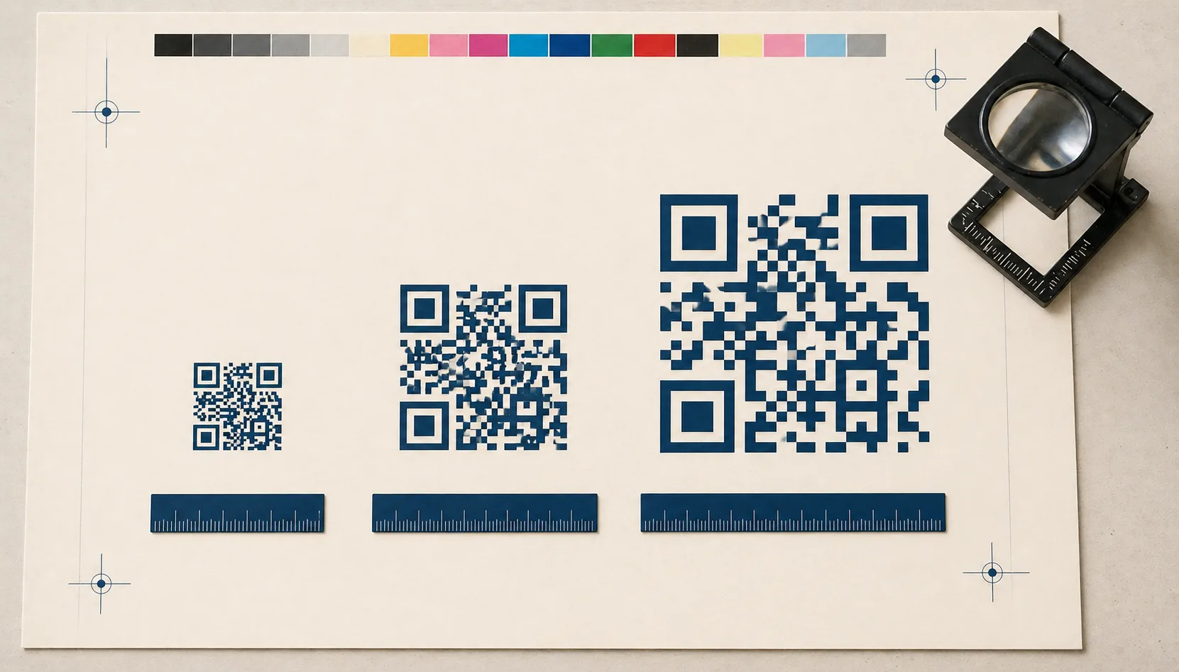
Module size matters more than overall size
Two QR codes with the same printed width can behave very differently:
A short URL produces a lower-version QR code with fewer modules. Each module is larger relative to the print size, and scanners read it easily.
A long URL with many parameters produces a denser code with more modules. Each module is smaller, and scanners need a sharper image to read it.
This is why your tracking strategy directly affects scan reliabilityHow consistently a QR code scans across different devices, lighting conditions, distances, and orientations. Read more →. If you tag every URL with full UTM parameters (?utm_source=poster&utm_medium=qr&utm_campaign=summer-2026&utm_content=variant-a), you may unintentionally make the code harder to scan at small sizes. The code that fits on a business card with a clean URL becomes a dense grid that fails at the same size with full tracking.
If you need attribution, options that preserve module size:
- Use shorter UTMs (
?u=poster&c=summer26). - Use a unique clean path per placement (
example.com/p/summer-poster). - Use a short redirect domain you control (
exmp.co/sp).
The static vs dynamic QR codes guide covers redirect strategies in more depth, and the error correction explainer explains how URL length maps to QR version and density.
Contrast: boring wins
The safest QR design is dark modules on a light background, with strong contrast that survives uneven lighting. That’s it.
Avoid:
- Light gray on white — looks modern, scans poorly under any glare.
- Pastel palettes with low contrast.
- Busy or photographic backgrounds behind the modules.
- Inverted codes on dark backgrounds, unless thoroughly tested across devices.
If you add a logo or styling, set error correctionMathematical redundancy built into every QR code that lets it scan correctly even if part of the matrix is damaged, dirty, smudged, or covered (for example by a logo). Read more → to H and test on multiple devices. The design best practices guide covers brand-color customization that doesn’t compromise reliability.
File formats: SVG, PNG, or JPG
For print production:
SVG is the best choice when your design tool and printer workflow support it. Vector scales cleanly to any output resolution without pixelation, and the file size is tiny.
PNG is a solid default for digital channels and many print workflows, but you have to plan the pixel dimensions for the final output size. At 300 DPI, a 5 cm code needs about 590 pixels square. At 600 DPI for high-quality print, 1180 pixels square. Generate larger than you need; you can always scale down without quality loss.
JPG is usually the worst choice for QR codes because the compression algorithm introduces artifacts at sharp edges, which is exactly what a QR module is. It can work when a platform requires it (some social or ad systems), generated at maximum quality.
Generate each format directly: SVG for vector design and print, PNG for web and most general use, or JPG when a specific platform requires it.
DPI and pixel-dimension targets
Print resolution requirements depend on viewing distance and substrate:
- Premium print (menus, business cards, hero packaging): 600 DPI at final size.
- Standard print (posters, flyers, retail signage): 300 DPI at final size.
- Large-format print (banners, vehicle wraps, bus shelter ads): 100-150 DPI is usually adequate, since viewing distance is much greater.
If you’re using a PNG, calculate the pixel dimensions like this: target size in inches × DPI = pixel width and height. A 4-inch QR at 300 DPI = 1200 pixels square.
If you’re using SVG, none of this math matters. The file scales to whatever resolution the printer needs.
Substrate and finish considerations
The physical material the code is printed on affects scanning more than most designers expect:
Glossy laminate or varnish introduces reflections that can wash out modules under bright light. If you’re laminating, test the code post-lamination on a real substrate, not a digital proof.
Kraft paper, recycled stock, or textured paper breaks the clean edges of modules. Brown kraft also reduces contrast against dark modules. Increase size by 25-50% on textured stock, and consider printing on a clean white sticker applied to the kraft surface for critical campaigns.
Curved surfaces (cans, bottles, mug handles) distort the code. Keep the QR area as flat as possible, and avoid placing it where the curvature is steepest.
Foil, embossed, or specialty finishes rarely work for QR codes. The reflective or three-dimensional treatment confuses the scanner. If brand identity demands a foil treatment, place the QR on a flat, matte panel adjacent to the foil element, not embedded in it.
Placement on the design
Good placement reduces scan friction:
Put the QR where the user naturally looks when the next action makes sense. On a menu, near the dish description. On a flyer, near the call-to-action. On packaging, on the back panel where instructions live.
Keep the QR away from folds, seams, and corners that tend to wear or get damaged. A code on a folded brochure crease is one fold-open away from being unscannable.
Provide a short instruction line so intent is clear. “Scan to view the menu” or “Scan to register” outperforms a bare QR every time.
Include a fallback URL for accessibility and for users with older devices, scratched cameras, or restricted scan apps. A short URL printed below the code is a cheap insurance policy.
For packaging specifically, avoid placing codes on highly curved edges, on textured areas that break module edges, and where store lighting will produce direct glare. The retail packaging playbook covers these decisions in production-relevant detail.
Testing before press: a real checklist
Before you send anything to press, test the QR code the way a real customer will encounter it:
- Print at actual size. Don’t judge from a screen preview. A code that looks fine at 200% zoom on a monitor can fail at 100% on paper.
- Scan in different lighting. Bright daylight, fluorescent office, dim restaurant, glare from overhead lights. Each one stresses the camera differently.
- Scan from realistic distances. Table distance for a menu, standing distance for a wall poster, walking distance for a hallway sign.
- Test on multiple phones. iPhone and Android at minimum, with at least one older or budget device. Newer flagships compensate for problems older phones won’t.
- Test after damage and finishing. A small scratch, a slight crumple, lamination, varnish. If the surface will be handled, simulate that handling.
If scans feel slow or inconsistent, the fix is usually one of: increase size, improve contrast, simplify styling, or shorten the URL. The best time to fix QR codes is before you print 10,000 copies. The print-ready QR checklist walks through pre-press review in more detail.
Sources
- Denso Wave — QR Code version — Module count and capacity for each QR version (1–40).
- ISO/IEC 18004:2015 — Print-quality requirements and reading-condition specifications.
- GS1 — Barcode verification — Industry standards for verifying barcode print quality before deployment.